Tang Yau Hoong for Quanta Magazine
Introduction
Simon DeDeo, a research fellow in applied mathematics and complex systems at the Santa Fe Institute, had a problem. He was collaborating on a new project analyzing 300 years’ worth of data from the archives of London’s Old Bailey, the central criminal court of England and Wales. Granted, there was clean data in the usual straightforward Excel spreadsheet format, including such variables as indictment, verdict, and sentence for each case. But there were also full court transcripts, containing some 10 million words recorded during just under 200,000 trials.
“How the hell do you analyze that data?” DeDeo wondered. It wasn’t the size of the data set that was daunting; by big data standards, the size was quite manageable. It was the sheer complexity and lack of formal structure that posed a problem. This “big data” looked nothing like the kinds of traditional data sets the former physicist would have encountered earlier in his career, when the research paradigm involved forming a hypothesis, deciding precisely what one wished to measure, then building an apparatus to make that measurement as accurately as possible.
“In physics, you typically have one kind of data and you know the system really well,” said DeDeo. “Now we have this new multimodal data [gleaned] from biological systems and human social systems, and the data is gathered before we even have a hypothesis.” The data is there in all its messy, multi-dimensional glory, waiting to be queried, but how does one know which questions to ask when the scientific method has been turned on its head?
DeDeo is not the only researcher grapping with these challenges. Across every discipline, data sets are getting bigger and more complex, whether one is dealing with medical records, genomic sequencing, neural networks in the brain, astrophysics, historical archives or social networks. Alessandro Vespignani, a physicist at Northeastern University who specializes in harnessing the power of social networking to model disease outbreaks, stock market behavior, collective social dynamics, and election outcomes, has collected many terabytes of data from social networks such as Twitter, nearly all of it raw and unstructured. “We didn’t define the conditions of the experiments, so we don’t know what we are capturing,” he said.
Today’s big data is noisy, unstructured, and dynamic rather than static. It may also be corrupted or incomplete. “We think of data as being comprised of vectors – a string of numbers and coordinates,” said Jesse Johnson, a mathematician at Oklahoma State University. But data from Twitter or Facebook, or the trial archives of the Old Bailey, look nothing like that, which means researchers need new mathematical tools in order to glean useful information from the data sets. “Either you need a more sophisticated way to translate it into vectors, or you need to come up with a more generalized way of analyzing it,” Johnson said.
Vespignani uses a wide range of mathematical tools and techniques to make sense of his data, including text recognition. He sifts through millions of tweets looking for the most relevant words to whatever system he is trying to model. DeDeo adopted a similar approach for the Old Bailey archives project. His solution was to reduce his initial data set of 100,000 words by grouping them into 1,000 categories, using key words and their synonyms. “Now you’ve turned the trial into a point in a 1,000-dimensional space that tells you how much the trial is about friendship, or trust, or clothing,” he explained.
Scientists like DeDeo and Vespignani make good use of this piecemeal approach to big data analysis, but Yale University mathematician Ronald Coifman says that what is really needed is the big data equivalent of a Newtonian revolution, on par with the 17th century invention of calculus, which he believes is already underway. It is not sufficient, he argues, to simply collect and store massive amounts of data; they must be intelligently curated, and that requires a global framework. “We have all the pieces of the puzzle — now how do we actually assemble them so we can see the big picture?” he said. “You may have a very simplistic model at the tiny local scale, but calculus lets you take a lot of simple models and integrate them into one big picture.” Similarly, Coifman believes that modern mathematics — notably geometry — can help identify the underlying global structure of big datasets. A data set might be organized by geography or climate, for example, each of which will produce a very differently shaped map.
Nodes and Edges
The Prussian city of Königsberg (now Kalingrad) on the Baltic Sea boasts four distinct geographical regions divided by the Pregel River, with seven bridges connecting those regions. In the 18th century, the mathematician Leonhard Euler puzzled over a popular conundrum of that era: Was it possible to walk across all the bridges of Königsberg, crossing each just once, and yet still end up at one’s original starting point? To solve the puzzle, Euler reduced the problem to one of nodes and lines: The four land regions were the nodes, connected by the bridges, represented by lines. He found that in order to cross all of the bridges only once, each land region would need an even number of bridges. Since that was not the case in Königsberg, such a journey was impossible.
Among the most notable insights Euler gleaned from the puzzle was that the exact positions of the bridges were irrelevant to the solution; all that mattered was the number of bridges and how they were connected. Mathematicians now recognize in this the seeds of the modern field of topology.
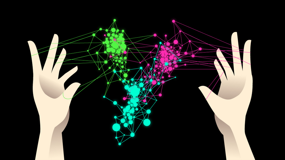
Taking a page from Euler’s playbook, Gunnar Carlsson, a mathematician at Stanford University, is representing cumbersome, complex big data sets as a network of nodes and edges, creating an intuitive map of data based solely on the similarity of the data points; this uses distance as an input that translates into a topological shape or network. The more similar the data points are, the closer they will be to each other on the resulting map; the more different they are, the further apart they will be on the map. This is the essence of topological data analysis (TDA).
TDA is an outgrowth of machine learning, a set of techniques that serves as a standard workhorse of big data analysis. Many of the methods in machine learning are most effective when working with data matrices, like an Excel spreadsheet, but what if your data set doesn’t fit that framework? “Topological data analysis is a way of getting structured data out of unstructured data so that machine-learning algorithms can act more directly on it,” said Carlsson.
As with Euler’s bridges, it’s all about the connections. Social networks map out the relationships between people, with clusters of names (nodes) and connections (edges) illustrating how we’re all connected. There will be clusters relating to family, college buddies, workplace acquaintances, and so forth. Carlsson thinks it is possible to extend this approach to other kinds of data sets as well, such as genomic sequences. “One can lay the sequences out next to each other and count the number of places where they differ,” he explained. “That number becomes a measure of how similar or dissimilar they are, and you can encode that as a distance function.”
The idea is to reduce large, raw data sets of many dimensions to a compressed representation in lower dimensions without sacrificing the most relevant topological properties. Ideally, this will reveal the underlying shape of the data. For example, a sphere technically exists in every dimension, but we can perceive only the three spatial dimensions. However, there are mathematical glasses through which one can glean information about these higher-dimensional shapes, Carlsson said. “A shape is an infinite number of points and an infinite amount of distances between those points. But if you’re willing to sacrifice a little roundness, you can represent [a circle] by a hexagon with six nodes and six edges, and it’s still recognizable as a circular shape.”
That is the basis of the proprietary technology Carlsson offers through his start-up venture, Ayasdi, which produces a compressed representation of high dimensional data in smaller bits, similar to a map of London’s tube system. Such a map might not accurately represent the city’s every last defining feature, but it does highlight the primary regions and how those regions are connected. In the case of Ayasdi’s software, the resulting map is not just an eye-catching visualization of the data; it also enables users to interact directly with the data set the same way they would use Photoshop or Illustrator. “It means we won’t be entirely faithful to the data, but if that set at lower representations has topological features in it, that’s a good indication that there are features in the original data also,” Carlsson said.
If your high-dimensional data set has 155 variables, how do you even begin to query it in a way that takes all of those variables into account? Carlsson compares the task to searching for a hammer in a dark garage. If the only tool you have is a flashlight, all you can do is shine the light into one small section of the garage at a time. You may find the hammer eventually, but you also might run out of patience with the piecemeal approach. It would be far more efficient to turn on one big light that illuminates the entire garage, giving you a global perspective. Not only will you spot the hammer, but you will also notice the box of nails sitting next to it that you didn’t realize you needed. Ayasdi’s technology is akin to illuminating the whole garage.
As proof of principle, Carlsson and collaborators at Stanford and the Institute for Advanced Study at Princeton applied this method to a more traditional data set from a Dutch genomics study on breast cancer patients conducted over a decade ago. Initially it was in the standard Excel spreadsheet form, with 1,500 columns and 272 rows corresponding to the genomic samples provided by the subjects. Once this was transformed into a network, the resulting “map” took the form of a Y shape, color coded to indicate which subjects survived (blue) and which subjects did not (red). Those patients with the worst prognoses were clustered in the left branch of the Y, with the right branch comprised exclusively of the 8 to 9 percent of the subjects who survived. Once that group had been identified, geneticists could eventually analyze the genes more closely to determine which ones were most likely to have influenced their survival.
The method is flexible enough to be applied to very different systems. One of Carlsson’s Ayasdi interns was a Houston native and a fan of the Houston Rockets. He created a dataset of all the NBA players from 2010 and compared their league averages in seven statistical categories: points, rebounds, assists, steals, blocked shots, turnovers and personal fouls, scaled down to one-minute intervals to ensure that playing time would not be a factor.
He initially presented the data in a standard Excel spreadsheet, with 400 rows for the players and seven columns for data points, but the Ayasdi software detected hidden statistical patterns among the players, linked to their playing styles, and created a map of these connections. The map showed that in addition to the five primary positions in basketball — point guard, shooting guard, power forward, small forward, and center — there were 13 “hidden” positions. He dubbed one category “paint protectors,” players who perform well at rebounding and blocking, but who rack up more fouls than points. “Scoring paint protectors” are similar, but rack up fewer fouls and more points. This work won the award for Best Evolution of Sport at the annual MIT Sloan Sports Analytics Conference, in part because of its potential usefulness for identifying undervalued players.
Topological methods are a lot like casting a two-dimensional shadow of a three-dimensional object on the wall: they enable us to visualize a large, high-dimensional data set by projecting it down into a lower dimension. The danger is that, as with the illusions created by shadow puppets, one might be seeing patterns and images that aren’t really there.
“There’s a terrible math joke that topologists can’t tell the difference between their rear end and a coffee cup because the two are topologically equivalent,” said Benjamin Recht, a computer scientist at the University of California, Berkeley who says it is so far unclear when TDA works and when it might not. The technique rests on the assumption that a high-dimensional big data set has an intrinsic low-dimensional structure, and that it is possible to discover that structure mathematically. Recht believes that some data sets are intrinsically high in dimension and cannot be reduced by topological analysis. “If it turns out there is a spherical cow lurking underneath all your data, then TDA would be the way to go,” he said. “But if it’s not there, what can you do?” And if your dataset is corrupted or incomplete, topological methods will yield similarly flawed results.
Occam’s Blocks
In February 2004, Emmanuel Candes, a mathematician at Stanford University, and his then-postdoc, Justin Romberg, were fiddling with a badly mangled image on his computer, the sort typically used by computer scientists to test imaging algorithms. They were trying to find a method for improving fuzzy images, such as the ones generated by MRIs when there is insufficient time to complete a scan. On a hunch, Candes applied an algorithm designed to clean up fuzzy images, expecting to see a slight improvement. What appeared on his computer screen instead was a perfectly rendered image. Candes compares the unlikeliness of the result to being given just the first three digits of a 10-digit bank account number, and correctly guessing the remaining seven digits. But it wasn’t a fluke. The same thing happened when he applied the same technique to other incomplete images.
The key to the technique’s success is a concept known as sparsity, which usually denotes an image’s complexity, or lack thereof. It’s a mathematical version of Occam’s razor: While there may be millions of possible reconstructions for a fuzzy, ill-defined image, the simplest (sparsest) version is probably the best fit. Out of this serendipitous discovery, compressed sensing was born.
Consider the case of online video streaming. The raw data in a video is enormous — thirty two-megapixel frames per second — so videos, or digital camera images, are stored using compression algorithms. Usually, in order to perform compression, one must first collect all the bits and store them, so that one can then discard those that are less significant. With compressed sensing, one can determine which bits are significant without first having to collect and store them all. This, says Recht, “allows you to acquire medical images faster, make better radar systems, or even take pictures with single pixel cameras.”
“If I screen a population for a rare disease, do I need as many blood tests as there are individuals?” Candes said. “The answer is no. I can do this with far fewer tests. My signal is sparse, since only a few people are expected to test positive.” Suppose there is one infected person in a group of 32, and the clinic pools all 32 blood samples. If the test is negative, there are no infected people. But if it is positive, how can you determine who is infected? According to Candes, you could take half the samples (16) and rerun the test. If it is positive, the infected person is in this group; if negative, the culprit is in the other half. You can continue to whittle down the possibilities by once again dividing the group in half and running the test again. This “holistic measurement” approach will give you the answer within five tests, compared to testing each of the 32 people one by one. This is the essence of compressed sensing.
Using compressed sensing algorithms, it is possible to sample only 100,000 of, say, 1 million pixels in an image, and still be able to reconstruct it in full resolution — provided the key elements of sparsity and grouping (or “holistic measurements”) are present. It is useful any time one encounters a large dataset in which a significant fraction of the data is missing or incomplete. In the case of medical records, a sensor might not record a data point accurately, or hospital staff might be too busy to log all the records into the computer or they might record the information incorrectly. Likewise, compressed sensing could be useful in combating occlusion in facial recognition systems — wearing sunglasses, for example, could be problematic if the eyes are a key variable in the analysis.
This approach can even be useful for applications that are not, strictly speaking, compressed sensing problems, such as the Netflix prize. In October 2006, Netflix announced a competition offering a $1 million grand prize to whoever could improve the filtering algorithm for their in-house movie recommendation engine, Cinematch. An international team of statisticians, machine learning experts and computer engineers claimed the grand prize in 2009, but the academic community in general also benefited, since they gained access to Netflix’s very large, high quality data set. Recht was among those who tinkered with it. His work confirmed the viability of applying the compressed sensing approach to the challenge of filling in the missing ratings in the dataset.
Cinematch operates by using customer feedback: Users are encouraged to rate the films they watch, and based on those ratings, the engine must determine how much a given user will like similar films. The dataset is enormous, but it is incomplete: on average, users only rate about 200 movies, out of nearly 18,000 titles. Given the enormous popularity of Netflix, even an incremental improvement in the predictive algorithm results in a substantial boost to the company’s bottom line. Recht found that he could accurately predict which movies customers might be interested in purchasing, provided he saw enough products per person. Between 25 and 100 products were sufficient to complete the matrix.
“We have shown mathematically that you can do this very accurately under certain conditions by tractable computational techniques,” Candes said, and the lessons learned from this proof of principle are now feeding back into the research community, addressing problems in quantum physics, X-ray crystallography, and computer vision, among other applications. In the future, astronomers working with telescopes sensitive to infrared light may only need to record 20 percent of the pixels they would otherwise need to get the same high-resolution images, because compressed sensing can fill in the gaps.
Recht and Candes may champion approaches like compressed sensing, while Carlsson and Coifman align themselves more with the topological approach, but fundamentally, these two methods are complementary rather than competitive. There are several other promising mathematical tools being developed to handle this brave new world of big, complicated data. Vespignani uses everything from network analysis — creating networks of relations between people, objects, documents, and so forth in order to uncover the structure within the data — to machine learning, and good old-fashioned statistics.
Coifman asserts the need for an underlying global theory on a par with calculus to enable researchers to become better curators of big data. In the same way, the various techniques and tools being developed need to be integrated under the umbrella of such a broader theoretical model. “In the end, data science is more than the sum of its methodological parts,” Vespignani insists, and the same is true for its analytical tools. “When you combine many things you create something greater that is new and different.”
Erica Klarreich contributed reporting. This article was reprinted on Wired.com.
Correction: This article was revised on October 7, 2013, to correct an imprecise description of Leonhard Euler’s solution to the bridges of Königsberg problem. The total number of bridges need not be even; just the number of bridges connected to each land region.


