How Can We Tell Which Forecasts Are True?

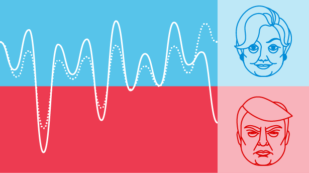
Are you one of those people who are so involved with the U.S. presidential election that you anxiously visit election-forecasting sites such as FiveThirtyEight, the Upshot or the Princeton Election Consortium (PEC) to look at their latest numbers? These poll-aggregating sites use sophisticated mathematical models to forecast the result of the presidential race. They provide numbers that boldly give each candidate’s probability of winning. This month, Insights invites Quanta readers to puzzle about principled ways to decide how much credence should be given to these numbers.
We are all familiar with innumeracy — the lack of a basic knowledge of mathematics. A significant proportion of the population is effectively mathematically illiterate and can easily be led astray by statistical statements and quantitative arguments in news stories. Innumeracy usually afflicts people who are not good with numbers, but there is a subtler affliction that does not spare mathematically competent people and sometimes affects them even more virulently — overprecision. As I described in my solution to Is Infinity Real?, we are conditioned to respect numbers calculated to multiple decimal places. We often ascribe mystical accuracy to them and fail to examine whether their precision is justified.
We have all encountered examples of this in real life. The standard joke concerns the museum docent who tells a visitor that a dinosaur skeleton is 75,000,005 years old. Why? The curator explains that it was 75 million years old when he started working at the museum five years earlier. I remember a geography textbook that declared that the distance between two cities was “about 1609.3 kilometers,” an absurdly overprecise translation of “about a thousand miles” that occurred when the country went metric. And I remember my then five-year-old son, who was used to precise Saturday-morning cartoon schedules, saying to me, “Daddy, come inside, it’s three minutes to the thunderstorm.”
Question 1
FiveThirtyEight and the PEC both predicted the outcome of the 2012 presidential race with spectacular accuracy. Yet on September 26 of this year, just before the first Clinton-Trump debate and 43 days before the election, FiveThirtyEight predicted on the basis of highly complex calculations that the chances for Clinton to win the election were 54.8 percent, while the PEC, with no doubt an equally complex model, estimated her chances to be 84 percent, almost 30 points higher. Both these models have highly successful histories, yet these numbers cannot both have been right. Do you think either number is justified as a principled prediction? Are these predictions meant only to titillate our psychological compulsion to have a running score, or do they have any other value? How many significant digits of these numbers can be trusted? How many presidential elections would it take to definitely conclude that one of these September 26 predictions was better than the other? And finally, as someone who backs a particular candidate, what is the wisest practical attitude to have about these probabilities?
In order to reason about this, we have to define what these probabilities mean. In Bayesian theory, the probability that a future event will occur is called a subjective probability, or credence, something that we encountered in the Sleeping Beauty puzzle. You can make the subjective probability practical by means of a bet: If you believe on a certain day that Clinton has, say, an 80 percent probability of winning, it means that you would rationally accept a bet that that gave you more than $5 for every $4 that you bet. Bookmakers make a living on this, so it matters a great deal to them. Interestingly, the odds offered by the major betting site Predict Wise on the same day reflected a probability that Clinton would win to be about halfway between the FiveThirtyEight and the PEC forecasts: 68 percent. But even if you win the bet, it does not validate the model you are using. You might have just been lucky.
Of course, if you are a purist and betting is not something you care for, you might give up on the actual numbers and focus only on the trend line. Every presidential race is punctuated by events that might affect the outcome — debates, revelations, hackings, foot-in-the-mouth episodes, tax-return sightings, 11-year-old videotapes and so on. It is often easy to say whether each event will affect a particular candidate’s chances positively or negatively. Yet trend lines cannot easily satisfy that insistent voice within you that wants to know the “score” with the faux authority of a decimal place.
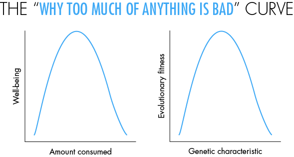
Nevertheless, there are some insights that can be gleaned just by looking qualitatively at the shapes of curves that do not have any numbers on them at all — something that would horrify a middle-school teacher teaching elementary graphs. Below I discuss a puzzle based on one of my favorite curves, the upside-down U curve, or what I call the “why too much of anything is bad” curve. This curve is similar to the Gaussian bell curve, or the downward parabola. But you do not need any numbers to learn from this curve. It occurs extremely often in real-world situations. Even those who are allergic to numbers can benefit from studying it and practice spotting it in the world around them.

In the right pane, you see the same curve illustrating an important point in evolutionary theory. Here the x-axis is any characteristic that has a genetic basis — say, your appetite for sugar, based on your genes. The y-axis is your evolutionary fitness — how much this trait contributes to your reproductive success. This graph helps to explain the truism “Everything you like is bad for you.” We originally evolved in an environment where things like sugar, fat and food were scarce — on the left, or upward, arm of the curve — so we evolved to like these far too much. In these days of plenty, we find ourselves on the right arm of the curve, resulting in cravings that are bad or even prematurely fatal for us.
Question 2
The graph in the right panel is the basis of an insight originally articulated by the eminent statistician and evolutionist Sir Ronald Fisher. Imagine that you as an individual are situated at some point on the curve. Presumably this would be at some point near the top, since the fact that you exist implies that you are a product of evolutionarily fit ancestors. If you have a large genetic mutation, you are likely to move to a different point on the curve, which will probably be bad for you. Yet, Fisher asserted, if the mutation were small enough, it would have a 50 percent chance of being good for you. Can you figure out why this should be so?
What will happen if we rotate the graph into a three-dimensional figure looking like a rounded cone and use it to represent not one but thousands of different characteristics? In what way will this modify these conclusions?
There is much to be learned just by looking at shapes of curves. For instance, we all know about the curve for exponential growth in mathematics. But, for the same reason that infinity does not exist in the real world, this curve does not really exist in real life — the curve too-quickly shoots toward infinity. It is usually replaced by the s-shape curve or the “all good things must end” curve (the generic version of the logistic curve) — or, if things get really ugly, by the upside-down U curve we just saw.
Understanding such qualitative processes with numberless curves does indeed provide insights, but you need to be careful. It is easy even for experts to reach false or controversial conclusions by considering only the shapes of graphs, as has been the case with the Laffer curve, which has the upside-down U shape we discussed above. So in most cases, it is indeed wise to follow the teaching of your middle-school math teacher and insist on proper numbering and scaling of all graphs.
Furthermore, every graph needs to be looked at with a critical eye, and the data examined in context, especially when the prediction is an electoral claim. It is as easy to mislead with graphs and numbers as it is with words. To paraphrase a common warning: caveat suffragator — let the voter beware! Coincidentally, the Latin root for “vote” from which we get the word “suffrage” is uncomfortably similar to the word “suffering.”
I look forward to further insights from you, Quanta readers.
Editor’s note: The reader who submits the most interesting, creative or insightful solution (as judged by the columnist) in the comments section will receive a Quanta Magazine T-shirt. And if you’d like to suggest a favorite puzzle for a future Insights column, submit it as a comment below, clearly marked “NEW PUZZLE SUGGESTION” (it will not appear online, so solutions to the puzzle above should be submitted separately).
Note that we may hold comments for the first day or two to allow for independent contributions by readers.
Update: The solution has been published here.


