How Colorful Ribbon Diagrams Became the Face of Proteins
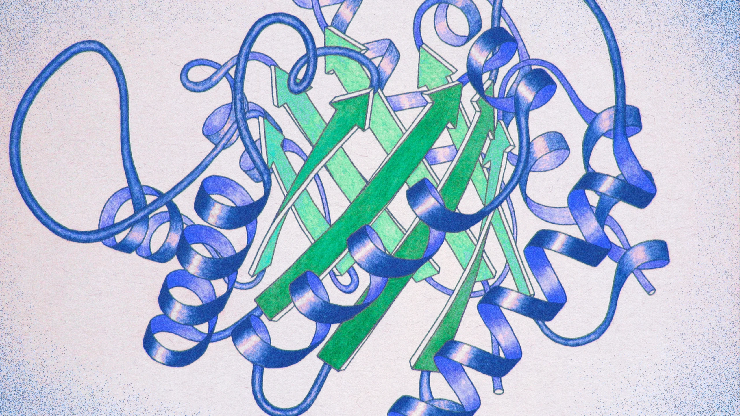
Jane Richardson’s ribbon diagrams abstract proteins’ atomic structures into beautiful, clear illustrations. In this pencil drawing of triose phosphate isomerase, alpha helices and beta strands are represented by blue spirals and green arrows, respectively.
Jane Richardson
Introduction
Jane Richardson never considered herself an artist. Then, in the late 1970s, the structural biologist found herself in need of some colored pencils, pastels and sketching paper.
Richardson, a professor of biochemistry at Duke University, studied proteins, the biomolecules that underpin all the workings of life. At the time, structural biologists were getting better at creating 3D models of proteins’ minuscule atomic structures; she and her husband Dave, with whom she shared a lab, had determined two of the field’s first 20 known protein structures. But the scientists struggled to convey the information to one another. The field had no standardized way to compare protein shapes. In scientific papers, the complex molecules were portrayed without uniformity, as if each researcher had invented their own way of illustrating them.
So Richardson took up the challenge of designing a new kind of scientific illustration — just for proteins. She studied how to represent three-dimensional shapes in two dimensions, including the artwork of M.C. Escher. She spoke with artists. She thought back to a class she had taken on illusions. She examined a belt as she twisted it left and right.
Then she picked up her pencils and began sketching. “I’m not an artist; I can’t draw anything else,” she said in a recent interview with Quanta. It was “a lot of draw and erase, draw and erase, draw and erase.” After a year of trial and error, she homed in on elegant sheets and looping ribbons to represent atomic structures. These drawings, which first appeared in the journal Advances in Protein Chemistry in 1981, became known as ribbon diagrams.
Richardson’s drawing style was quickly adopted. Structural biologists appreciated how well the diagrams conveyed the folds of a protein’s molecular backbone and how they allowed researchers to compare different proteins using the same visual language.
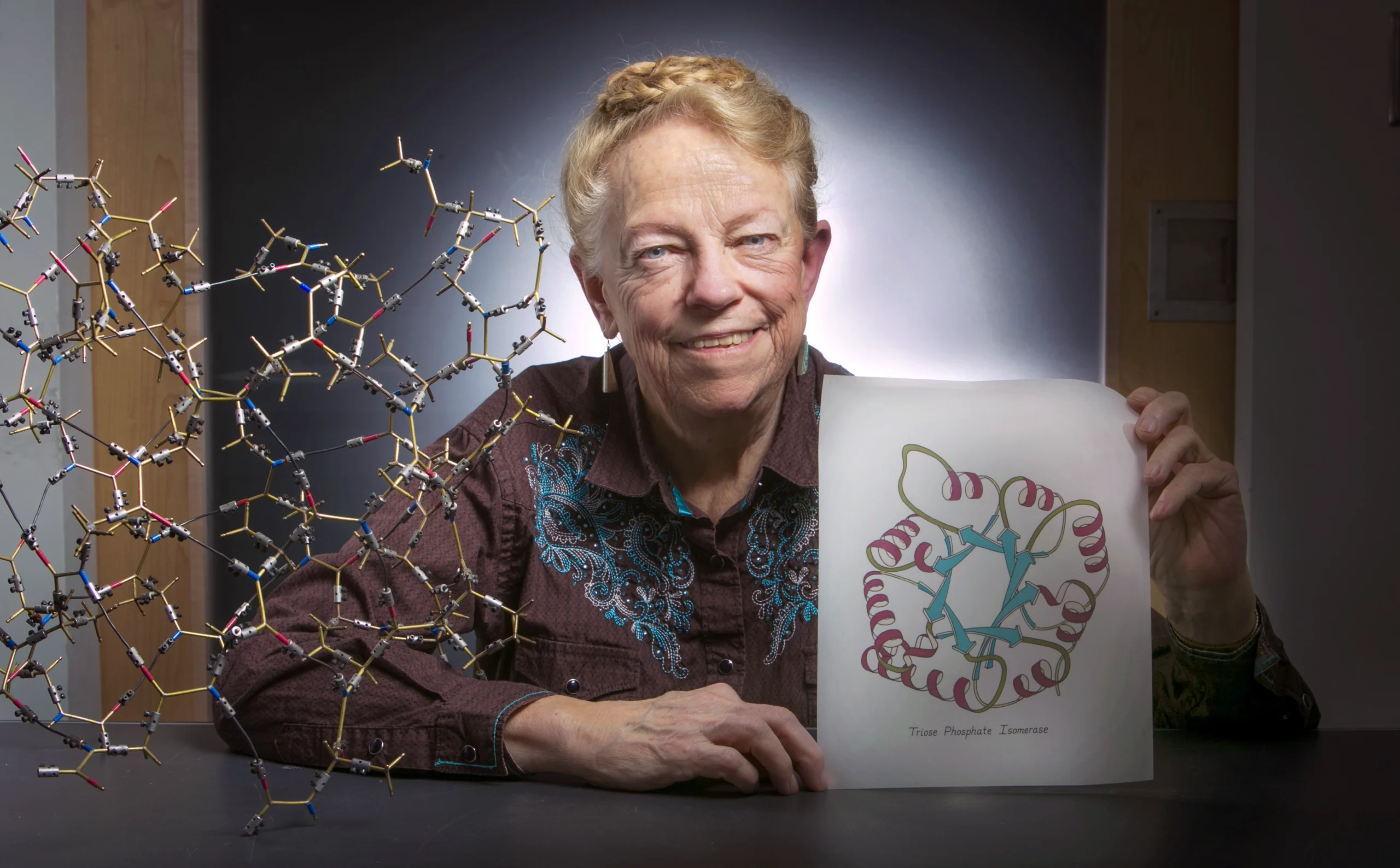
Jane Richardson, a structural biologist at Duke University, spent the early 1980s studying art. Her ribbon diagrams, which represent protein molecules, show proteins’ elegance and complexity without being overwhelming, she said.
Jared Lazarus/Duke University
“The ribbon-diagram representation was invaluable,” said Anastassis Perrakis, a structural biologist at the Netherlands Cancer Institute and Utrecht University. It helped scientists communicate, teach and classify protein structure, and it captured the imaginations of scientists and nonscientists alike. It was able to “convince people how elegant [proteins] are and to see the complexity, without it being overwhelming,” Richardson said.
Today, ribbon diagrams are the ubiquitous face of proteins in scientific articles, textbooks and magazines, known for their particular combination of clarity and beauty. “It’s hard to imagine a scientific representation of data that is more meaningful,” said Philip Bourne, dean of the University of Virginia School of Data Science.
The diagrams have been so successful that it can be hard to remember that our cells are not, in fact, filled with colorful ribbons and broad arrows.
The Face of Proteins
Day in and day out, our cells are hard at work constructing different kinds of proteins. Proteins are made of strings of molecules called amino acids, and each amino acid has one or more side chains made up of several atoms “coming off it like a lollipop,” said Janet Thornton, a computational biologist who retired from the European Molecular Biology Laboratory last year. The amino acid backbone innately folds into a three-dimensional shape, known as a protein structure, which determines which other molecules the protein can bind to and, therefore, its function in a cell.
Once a structural biologist completed what used to be a years-long process of reconstructing a protein’s 3D structure, they faced a new problem: how to communicate that structure to other scientists. In truth, it’s impossibly difficult to represent a protein’s realistic structure. Proteins are minuscule, on the order of nanometers, and can contain hundreds of thousands of atoms. “If those atoms are all drawn and then joined together, it becomes very difficult to see,” Thornton said.
Richardson’s innovation was a reproducible method of representing the folds of a protein’s amino acid backbone without getting bogged down in the details of specific atomic arrangements. She relied on proteins’ tendency to fold into two energetically favorable shapes: coils called alpha helices and flat shapes called beta strands, which can line up into so-called beta sheets. Then there are loops, which connect alpha helices to beta strands like corner pieces in a puzzle.
There are other folding structures, and “people have come up with lots of names” for them, Perrakis said. “But at the end of the day, the ones that matter are the helices and the sheets.”


Mark Belan for Quanta Magazine
In her year of sketching, Richardson came up with simple ways to illustrate these basic shapes. Alpha helices are coils that look like the tails of decorative ribbons, curled with the edge of a pair of scissors. Beta strands are arrows that point in the direction in which the amino acid chain was built. And thin wires represent the loops and turns that connect the structures. “That allowed us to follow the chain round and to see these folds and visualize them in three dimensions,” Thornton said.
Richardson’s drawings quickly caught on among biologists for the way they blend beauty with scientific accuracy. “They’re almost miraculous to me. I couldn’t begin to do it,” Thornton said. “People would write to Jane and say, ‘Will you do a drawing of my structure?’ … It was obvious that nobody else could draw such beautiful diagrams.”
But Richardson couldn’t spend all her time drawing proteins. So biologists turned to computers for artistic help. About a decade after the diagrams’ 1981 debut, researchers developed algorithms to generate ribbon diagrams on computers. Richardson often collaborates with computer scientists working to bring new features to the diagrams. And they’re still used today: As artificial intelligence has seeped into the field of protein science, ribbon diagrams are outputs from algorithms such as Google’s AlphaFold2.
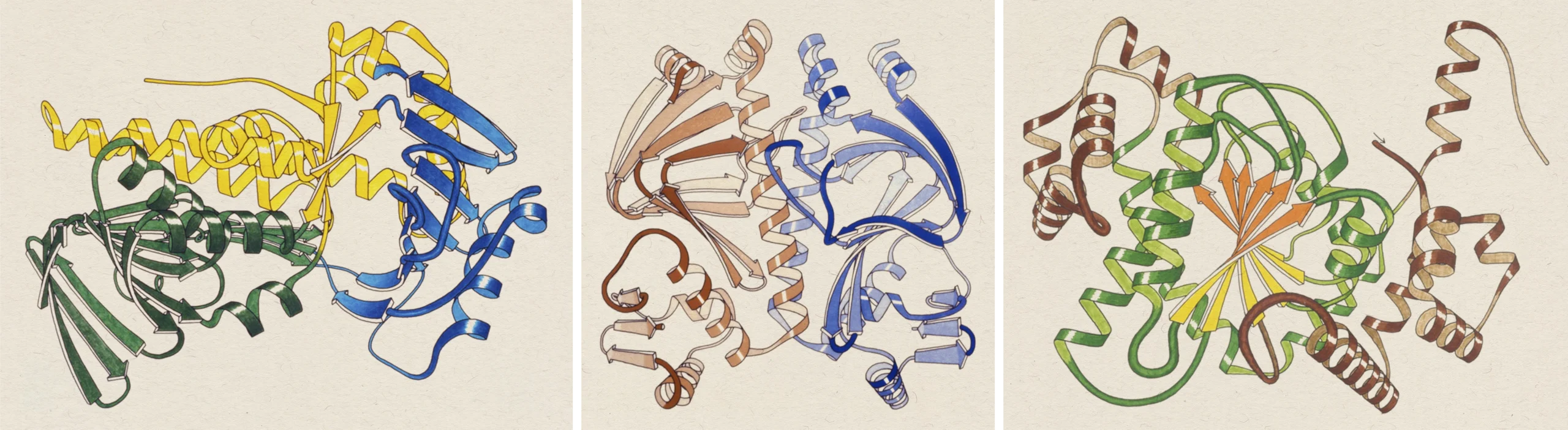
Jane Richardson’s hand-drawn ribbon diagrams communicate protein structure consistently and elegantly. From left: para-hydroxybenzoate hydroxylase, catabolite activator protein, glycogen phosphorylase.
Jane Richardson
Richardson is glad she doesn’t have to personally draw the many protein structures that have now been decoded. “I don’t have the eyes for it anymore, or the time,” she said.
Beyond Ribbons
Richardson’s ribbon diagram has become so ubiquitous, it can be difficult to imagine proteins looking any other way. Bourne often reminds his students that proteins don’t actually look like that.
“A protein is nothing like a ribbon,” he said. It’s much more dynamic, he added. Sure, proteins’ backbones fold up into structures like the coils and sheets that the ribbon diagrams represent. But researchers can’t actually see those structures when they image proteins.
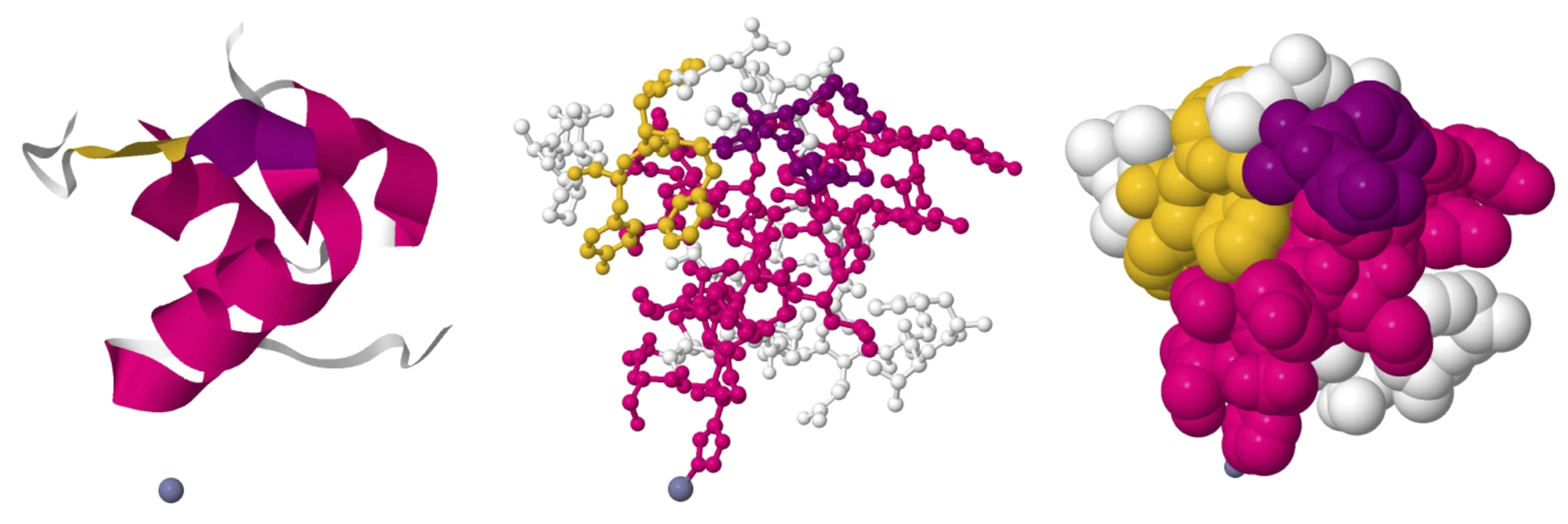
Different ways of modeling proteins convey different kinds of structural information. From left: Ribbon diagrams show the amino acid backbone. Ball-and-stick models place every atom exactly. Space-filling models reveal binding sites for other molecules.
Protein Data Bank
“I like to think of them as soft silicone models,” Perrakis said. “You can squeeze them a bit or bend them.”
As simplifications, ribbon diagrams have their limitations, of course. They can’t convey some structural elements, such as tunnels or pockets where other molecules might bind — information critical for understanding how proteins work and designing drugs to target them. They also don’t communicate structure well for larger proteins or complexes of multiple proteins.
“It gives you a three-dimensional view of the shape, but it also hides a lot of the features that we know to be true about proteins,” Bourne said. “So that then can narrow one’s thinking.” He called this “the curse of the protein ribbon diagram” in a 2022 essay.
Another popular representation is the space-filling model, which shows how much room atoms take up and looks more like an actual protein. It can show proteins’ pockets and tunnels — but it can’t represent the protein architecture, such as helices and sheets. “It depends what you want to show,” Perrakis said. Many researchers look at different types together to glean all the important structural information. What a protein looks like, Richardson said, is how you choose to represent it.
“That’s one of the freeing things about drawing proteins … It’s also scary,” she said. “It’s a little weird to me that everybody sees proteins the way I see them, or the way I saw them in 1980.”
Her diagrams are a pretty good way to see them, she added. “But it’s not the only way, that’s for sure.”
Update: August 26, 2024
A figure of a protein loop in the graphic was removed while we investigate a potential correction.